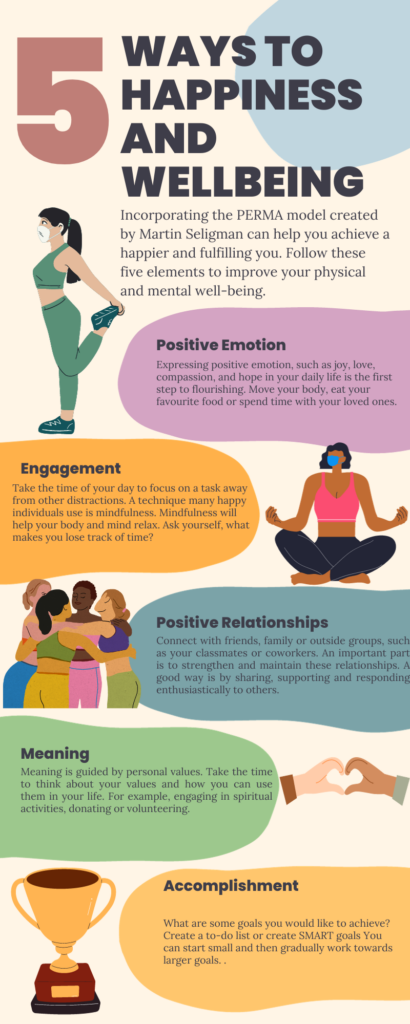
This week I decided to create an infographic on Canva based on the PERMA Model by Martin Seligman. I decided to use the PERMA Model because I first learned about it in a Positive Psychology course, and it always stuck with me. In this module, I also explored WAVE and found the results to be super interesting.
Design Principles
When working on my infographic on Canva I considered alignment, hierarchy and proximity principles.
Alignment: The alignment principle allows the reader to understand which elements are connected and which ones are not by lining up text or graphics on a page (Gaskin, 2022). The infographic I created used the alignment principle by using left or right alignment for the corresponding graphics to each text bubble. I decided to do this to make it easier for the reader to follow along with the infographic by connecting the ideas to the graphics. Since Canva had the template already created for me, the alignment principle was much easier to achieve as I only had to edit the text and change the graphics. I decided to create an infographic from scratch without using the templates. My experience overall was a bit more challenging trying to align the text and graphics. However, I found Canva’s grid lines, horizontal and vertical lines and rulers helpful in utilizing the alignment principle.
Hierarchy: The hierarchy principle is also used to organize elements, but also to show importance. I utilized the hierarchy principle by making the titles and headers larger and using the bold option so that they stand out. I wanted to make use of this principle because it would help the reader know what parts of the infographic to focus on when reading and where to start. The title is the largest, which automatically draws the eyes there when first looking at the infographic.
Proximity: The proximity design principle is where related objects are placed close together and unrelated ones are far (Gaskin, 2022). The proximity principle was utilized by placing an image next to each bubble text. For example, a graphic of a group of friends was placed next to the positive relationships text. It automatically tells the reader what to expect before reading.
What does the template make easier and what does it make harder when creating your infographic?
As I mentioned previously, I created my infographic using one of the Canva templates and also tried making one by scratch. I found the template easier to edit if the already-made template had elements and colours that worked with my topic. For example, having the five bubble text and images worked for the PERMA model. This is because all I had to do was edit the text and graphics on the page. However, trying to make one from scratch allowed me to use more of my creativity to make the infographic. I was able to explore other design elements that Canva has to offer. The downside is how time-consuming it is because of the freedom to do anything.
WAVE Summary
What did you find when you ran the WAVE accessibility report on your blog post(s)? What did you expect and what was surprising? Is there anything you will do differently going forward?
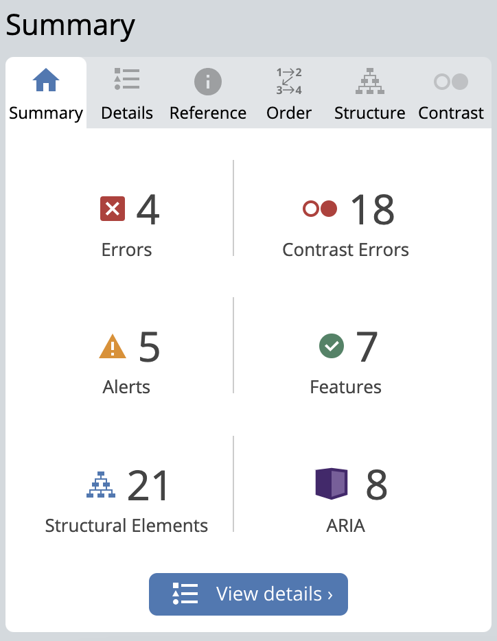
After looking at the WAVE accessibility report, I was surprised to see my results. I found 4 errors, 18 contrast errors, 5 alerts, 7 features, 21 structural elements and 8 ARIA. I first looked at the 18 contrast errors and it said there was low contrast between the text and the background. I also found it interesting that a figure is present on the page but cannot be viewed. I then checked on WordPress and found a figure element added. WAVE also found a skipped heading level where there was lots of space but no heading or text. I plan to erase this extra space next time.
References
Cuofano, G. (2023). What is PERMA Model? The PERMA Model in a nutshell. FourWeekMBA. https://fourweekmba.com/perma-model/
Gaskin, J. (2022). A Brief Guide to Alignment – A Design Principle. VennGage. https://venngage.com/blog/design-principle-alignment/
Gaskin, J. (2022). A Brief Guide to Proximity – A Design Principle. VennGage. https://venngage.com/blog/design-principle-proximity/
Gaskin, J. (2022). What is Visual Hierarchy & Why It’s Important in Business Communication. VennGage. https://venngage.com/blog/visual-hierarchy/
charliemccullough 2023-10-08
I really like your infographic! Your use of balance is really well done. I also thought you used nice, simple images and colours that don’t distract from the information. Well done!
kmcnaughton 2023-10-14
Hi Nat!
I loved this post. It is very clear you understood the material and I enjoyed reading what you found surprising. I also tried creating an infographic with a template and by hand and found that the template not only looked better but was a much better choice for inclusivity design.
I really enjoyed reading through your thoughts this week!
Thank you for sharing